How Black and White Superhero Films Create Visual Identity in the Marvel Universe
Nova Patricks··9 min read
Ad SpaceArticle Top - 728x90
Advertisement
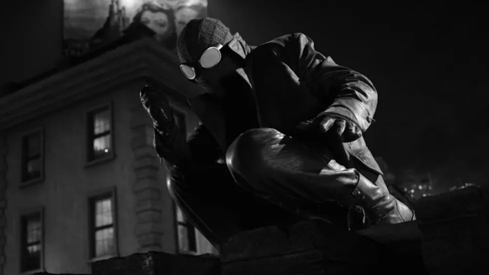
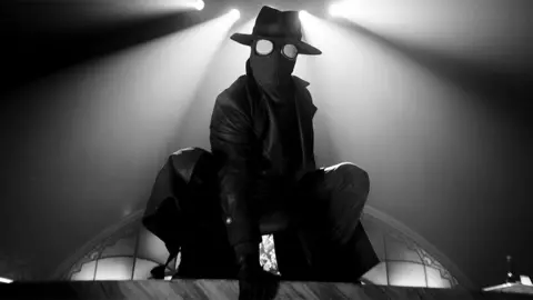
A camera glides across a rain-slicked New York rooftop in 1933. The skyline is reduced to ink and ash. A figure in a fedora crouches at the edge of a water tower, his trench coat catching the wind. There is no red and blue suit, no quippy banter, no neon billboard humming behind him. Just shadow, silk-screen contrast, and the wet shine of a fire escape. This is Spider-Man Noir, and the first thing the audience registers is not the character. It is the absence of color.
That absence is the point. As Marvel and other studios chase fatigue-proof formats in an increasingly crowded superhero landscape, the monochrome palette has become one of the most powerful tools in the visual identity toolkit. It is shorthand for prestige, distance, and moral weight. It separates a character from the wallpaper of capes-and-tights cinema without rewriting a single line of dialogue.
The choice is older than Marvel itself, and it stretches across film, television, and the comic page. What links Frank Miller’s panels to a Logan special edition to a Penguin flashback is the same instinct: when a story wants to be taken seriously, the colorist gets the day off.
A heritage older than the cinematic universe
Black and white in superhero storytelling did not begin with streaming. It started on newsprint, with the limitations of the medium dictating the aesthetics. Early comic strips were monochrome by necessity, and even after color became standard, certain creators returned to the high-contrast palette as a creative statement.
Frank Miller’s “Sin City,” serialized through Dark Horse in the early 1990s, weaponized the absence of color. His panels were not greyscale. They were stark, pure black against pure white, with occasional accents of red or yellow that detonated like flares. The aesthetic borrowed from German Expressionist film, hardboiled crime novels, and woodcut prints. Miller had already pushed the same instinct in “Daredevil: Born Again” in 1986, where colorist Lynn Varley used muted, near-monochrome palettes during the character’s most desperate stretches.
Sin City’s 2005 film adaptation, co-directed by Robert Rodriguez and Miller, translated the page almost panel for panel. Green-screen photography preserved the inky look, and the few color accents - the dress on a doomed character, the red sole of a shoe - became as recognizable as any costume in superhero cinema. The film was not, technically, a superhero movie. But its DNA bled into everything that followed.
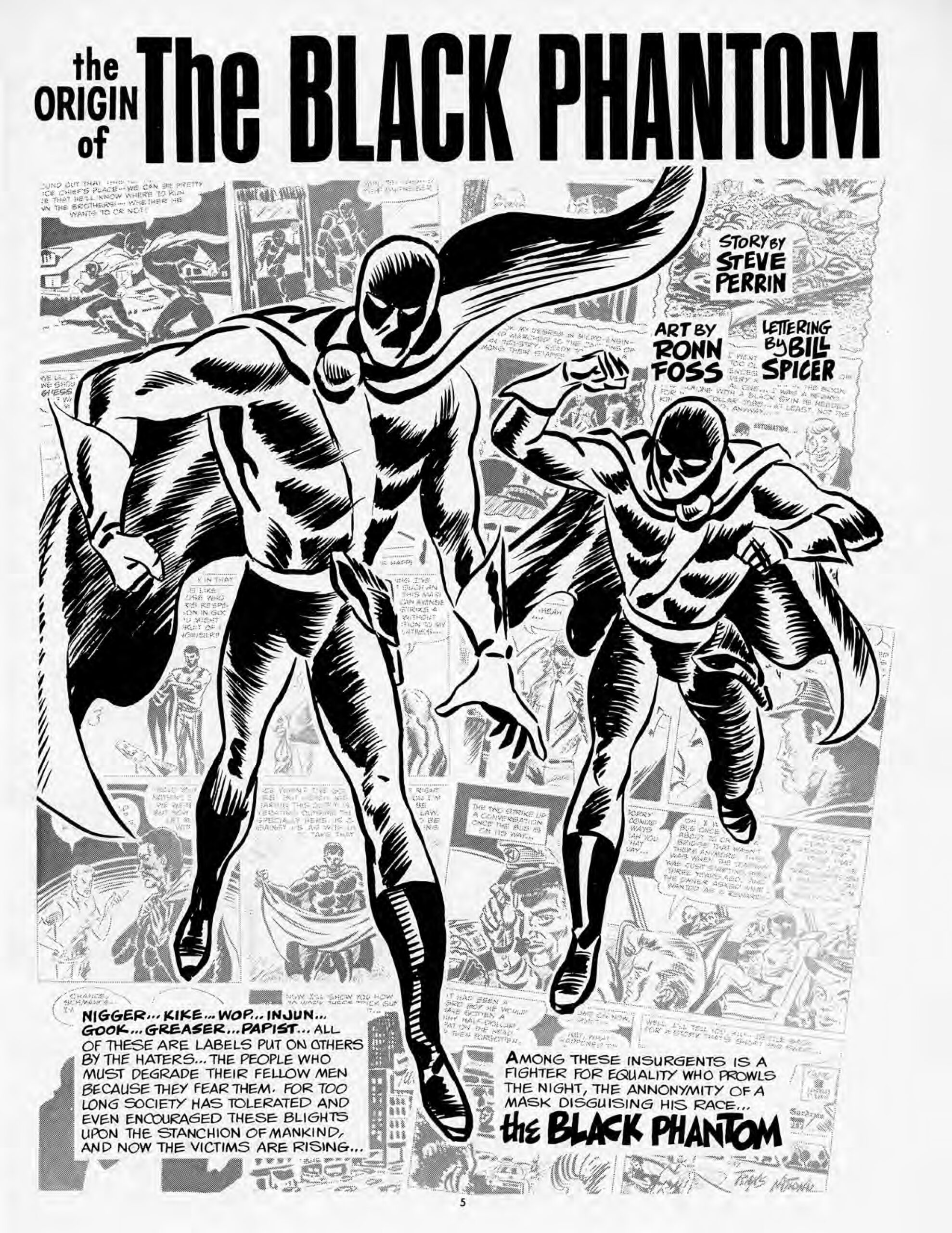
Marvel’s own black and white history runs through magazines like “Savage Sword of Conan” and the original “Tomb of Dracula” magazine, where the absence of four-color printing allowed artists to attempt heavier shading and more adult content. The same trick lets modern creators signal that a story sits slightly outside the main canon, slightly more grown up, slightly more concerned with consequences than spectacle.
Why studios reach for monochrome
The commercial logic is straightforward. A superhero film stripped of color performs three jobs at once.
First, it differentiates. With dozens of caped properties competing for screen time, anything that breaks visual habit is worth marketing dollars. The 2019 release of “Logan Noir,” a black and white cut of James Mangold’s “Logan,” sold itself almost entirely on the strength of its palette. The film was already on home video. The Noir cut justified a second purchase by offering a fundamentally different reading of the same footage. Mangold was open about the intent, telling press that Logan was always shot to be photographed in black and white, with the color version a concession to the modern market.
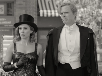
Second, monochrome signals prestige. Audiences have been trained, since the rise of mid-century cinema, to associate black and white with seriousness. “Schindler’s List,” “Manhattan,” “Roma,” “The Lighthouse” - the format reads as artistic intention rather than commercial calculation. When a superhero project adopts it, the implicit pitch is that this is not just another Tuesday at the multiplex.
Third, it manages mood with brutal efficiency. Color is information. Removing it forces the audience to read texture, light, and composition more carefully. A grimy alley becomes grimier. A clean white shirt becomes a beacon. A bruise becomes a smudge of ink rather than a purple stain. The aesthetic does emotional work that color cinema has to earn through other means.
Where the technique sings
“The Penguin,” the 2024 HBO limited series spun off from Matt Reeves’s “The Batman,” used monochrome flashbacks to anchor Oswald Cobb’s childhood and his fractured relationship with his mother. The sequences were not full noir. They were closer to dimmed Polaroids, drained of color until only the cold blue of memory survived. The contrast with the saturated, neon-soaked present made each flashback feel like a wound being reopened.
“Spider-Man Noir,” the character introduced in the 2008 comic by David Hine and Fabrice Sapolsky and adapted into “Spider-Man: Into the Spider-Verse” with Nicolas Cage’s voice work, leans into 1930s pulp iconography. The Spider-Verse animators rendered him in greyscale even when surrounded by full color variants. The visual contradiction is the joke and the thesis. Noir does not fit. That is why he works.
The character’s upcoming live-action series, announced as part of Amazon and Sony’s expanded Spider-Man slate, is built on the same gamble. A fully colored period detective story would risk feeling like a costume drama with web-shooters. Stripped of color, the project gets to lean into Dashiell Hammett, gas-lamp shadows, and the existential exhaustion of a hero who has read too many crime files.
“Sin City: A Dame to Kill For” and the recurring black and white sequences in “Logan Noir” form the other anchor. Both treat color as a luxury the protagonist no longer deserves. In Logan’s case, the palette suggests a character who has outlived his own myth and is now operating in the leftover footage of a finished story.
What it signals about the character
A hero filmed in black and white is rarely an optimist. The aesthetic carries a moral payload, and casting directors and showrunners know it.
Ad SpaceIn-Article - 300x250
Advertisement
Monochrome reads as gritty by default. The character is usually older, tired, morally compromised, or operating at the edges of their universe’s ethical map. Logan is dying. Spider-Man Noir is a Depression-era vigilante who shoots people. Daredevil in “Born Again” has been broken down to nothing. The Penguin’s flashbacks expose a child shaped by violence he could not control.
The palette also signals retro temporality. Black and white places a story in conversation with the past, whether that is the 1930s pulp tradition, mid-century film noir, or the photojournalism of war zones. When Wakanda’s flashbacks in some comic adaptations slip into ink wash, they pull readers toward the long memory of African oral storytelling rather than the bright present of a fictional super-state. Done well, the choice deepens. Done lazily, it just looks like Instagram filters.
The third signal is moral ambiguity. Color cinema codes good and evil through hue. Black and white forbids that shortcut. A villain in a grey suit and a hero in a grey suit look identical at thirty paces. The audience has to read motive through behavior, not costume design, which is why noir has always been the natural home of the antihero.
Where it falls apart
The technique fails when it is decorative rather than structural. A black and white sequence dropped into a colorful film as a marketing stunt rarely works. Audiences notice the absence and ask what it is doing. If the answer is nothing, the trick burns through goodwill quickly.
Several streaming superhero projects have attempted monochrome opening credits, dream sequences, or single-episode experiments without committing to the underlying tone. The result reads as a borrowed costume. The hero is still quippy. The villain still monologues. The set is still lit for color. Removing the saturation in post-production does not transform a story that was conceived in primary hues.
The risk is greater in the streaming era, where algorithmic thumbnails reward bright, recognizable imagery. A black and white title card can underperform in recommendation feeds, and platforms have been known to commission color promotional artwork even for monochrome shows. The aesthetic that signals prestige inside the film can become a marketing problem outside it.
There is also the question of accessibility. Color helps viewers with certain processing differences track action, distinguish characters, and follow geography. Monochrome action scenes, when poorly choreographed, can collapse into visual mud. The Mangold cut of Logan worked because every frame was composed with the format in mind. A retrofit rarely survives the test.
The African screen and the monochrome instinct
African cinema has its own relationship with black and white, separate from the Western superhero tradition but increasingly relevant as the continent’s filmmakers enter the superhero space. The mid-century newsreel aesthetic and the documentary tradition gave African screens a long monochrome heritage that streaming platforms are starting to mine.
When Nollywood and Nairobi-based studios approach genre work, the temptation to import full Marvel-style color grading is strong. The audiences that grew up on imported superhero films expect a certain visual vocabulary. But the alternative path, leaning into monochrome, sepia, or limited palettes, offers a way to signal authorship and locality without abandoning the genre.
Roye Okupe’s YouNeek Studios has experimented with this in graphic novels, and the recent animated adaptations of properties like “Iyanu: Child of Wonder” have shown what happens when African superhero work refuses to default to American color logic. The instinct is not new. It is the same instinct that drove Frank Miller toward ink and Mangold toward Logan Noir. A different palette is a different argument about what the story is for.
What the monochrome decade looks like
Spider-Man Noir’s expansion, the continued success of grounded prestige shows like “The Penguin,” and the long shadow of Logan suggest that black and white is no longer a one-time experiment. It has become a mode that studios reach for when they want to extend a property without repeating themselves.
The next decade will likely see more limited series, special editions, and standalone films built around the absence of color. Disney and Warner Bros. have both filed patents and trademarks around alternate cuts and palette-specific releases, and the streaming math favors any version of an existing asset that can be re-monetized.
The danger is overuse. Every visual technique that promises prestige eventually becomes a cliche, and the moment audiences start to read monochrome as a marketing tactic rather than an artistic one, the spell breaks. Frank Miller’s panels still work because Sin City committed totally. Logan Noir works because Mangold composed for it. The next wave of black and white superhero work will succeed only if it earns the choice the same way.
A palette that refuses to fade
The superhero genre has spent two decades training audiences to expect saturation, spectacle, and the bright primary colors of merchandise-ready iconography. The monochrome counter-tradition has survived inside that machine by doing something the rest of the genre cannot. It slows the eye, raises the stakes, and asks viewers to look harder at what is actually on the screen.
Spider-Man Noir, when he steps into live action, will be measured against that long tradition. So will every future black and white superhero project, from Marvel’s prestige experiments to whatever African studios decide to do with the format. The palette is not a costume. It is a contract between the filmmaker and the audience, signaling that the story being told is one that color would dilute. When the contract is honored, the result is unforgettable. When it is broken, the audience notices instantly. That is the gamble every monochrome cape film makes, and it is what keeps the format alive.
The next test will come from how directors handle the inevitable backlash. Audiences who came to superhero films for spectacle will not always reward restraint, and producers measuring opening weekends will look for ways to dilute the format the moment a monochrome experiment underperforms. What the last fifteen years of black and white capework has shown is that the format survives that pressure when the storytelling underneath it is strong enough to make color feel beside the point. Spider-Man Noir, Logan, the Penguin flashbacks, and the long shadow of Sin City all share that same structural backbone. The aesthetic is the surface. The argument underneath, that some heroes belong to a world too bruised for primary colors, is what keeps the format honest. As long as creators keep finding that argument, the monochrome cape will keep finding its audience.
Ad SpaceIn-Article - 300x250
Advertisement
Share
Get the recap
Loved this story? Get more like it.
Join readers who get our weekly entertainment recap - the stories worth your time, delivered every Friday.
No spam. Unsubscribe anytime. By signing up you agree to our Privacy Policy.